DOL Redesign
THE PROBLEM:
The department of labor site had some navigation issues in terms of ease of use to find topics and clipping on the mobile version.
THE SOLUTION:
The solution was a more easy to approach design
MY ROLE: UI designer (Individual Project)
TOOLS: figma,figjam, laptop, pencil, paper
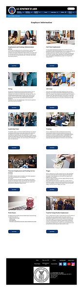
Before

After

Research
For user research I learned what the mission is for Department of Labor and what services they provide. The Department of Labor improves working conditions for wage earners and helps to make sure that their rights in the workplace are met. The department of labor provides resources to users from forms that can be completed online or printed, to access to agencies that ensure the needs and benefits of workers are met at their places of employment.
I also looked into what are some of the most important aspects of the department of labor when it comes to the people who would most frequent the site, the workers. Information to things like the family leave and medical act, fair labor standards, maternity leave, and unemployment insurance were some of the ,most needed categories in which assistance was needed with the department of labor having the necessary information for those seeking it.


User Persona

User Path

User Test
I conducted some user test to determine the ease of navigation for the DOL website. I hoped to learn what issues users may have when navigating for specific information and what I could do to improve it. What I found was the site felt overwhelming to users with the amount of links, the drop down menu for topics in top navigation was confusing, and some links were not made obvious and were difficult to find.
Priority Matrix

Usability Test
I performed 4 more usability test. 2 for the desktop version of the DOL website and 2 for the mobile version. This time i had different tasks to test navigation with finding the states unemployment office and finding a health insurance claim form. The tests showed that the navigation was straightforward with only slight confusion for alphabetization for forms. The main issue was the mobile site. The content was visibly very narrow in its display with cut content from the screen and a lot more scrolling had to be done. Also the state selection map is missing.


Card Sorting

Site Map

Lofi Prototype


Feedback & Changes
I performed some 5 second tests and from that iterated my design to have a bigger government agency name, have less white space, and change the priority of navigation items. Based off user test changes were made to the site design like the dropdown menu order to place the ones that were more important first, more legible text in the dropdown menu items and a larger font for site name recognition.
Style Tile